![]() ESTEIO’s history began 55 years ago, with its foundation in 1969. Technological innovations have always paved the company’s way. In countless moments in our history, we have pioneered the introduction of novel equipment, technology and products in Brazil, such as, for example, GPS survey, digital orthophoto, true orthophoto, aerial LiDAR survey, digital aerial sensor, mobile LiDAR, road auscultation, digital inspection of pavements, dynamic retroreflected survey, aerial bathymetry, use of drones in supervising the construction of roads, software and application development, oblique imaging, hybrid sensors, 3D city modeling, among many others. Even though our previous logo was appealing to us, we felt the need to modernize it, switching to a lighter graphical concept, still rooted on the previous wordmark, and more coherent with what we do and what we have become along these many years on the market. The characteristic blue color has been preserved for representing the innovation, technology, professionalism, and reliability of our services. We may have changed our visual identity but we have kept our essence.
ESTEIO’s history began 55 years ago, with its foundation in 1969. Technological innovations have always paved the company’s way. In countless moments in our history, we have pioneered the introduction of novel equipment, technology and products in Brazil, such as, for example, GPS survey, digital orthophoto, true orthophoto, aerial LiDAR survey, digital aerial sensor, mobile LiDAR, road auscultation, digital inspection of pavements, dynamic retroreflected survey, aerial bathymetry, use of drones in supervising the construction of roads, software and application development, oblique imaging, hybrid sensors, 3D city modeling, among many others. Even though our previous logo was appealing to us, we felt the need to modernize it, switching to a lighter graphical concept, still rooted on the previous wordmark, and more coherent with what we do and what we have become along these many years on the market. The characteristic blue color has been preserved for representing the innovation, technology, professionalism, and reliability of our services. We may have changed our visual identity but we have kept our essence.
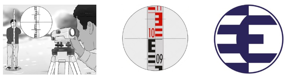
Nowadays, even though levels still do exist, the vast majority of our altimetric surveys, whether for engineering or aerial survey purposes, is performed with laser or digital technology equipment. The graduation on the leveling staff, whenever necessary, has been replaced with a barcode rod, and the field notebook no longer exists. Despite its importance in engineering, geometric leveling represents only a very small portion of the services we currently perform. Stadiametric rangefinding has been gradually replaced with tape measures, distance meters, total stations, and indirectly with satellite receivers using GPS, GLONASS, Galileo, and Beidou constellations. Hence, someone who hasn’t gone through classic stadiametric rangefinding will hardly connect the previous logo with this engineering point of view.
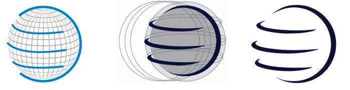
Along with geometric leveling and stadiametric surveying, ESTEIO’s engineering and aerial surveying services have also evolved greatly. At the beginning of our operations, the majority of our contracts involved topography, which considers the surface of the earth as a plane, since the effect of the curvature interferes little with the precision of engineering services over small pieces of land. Nowadays, most of our applications consider the land as it really is, without simplifications: Our daily engineering and consulting routine englobes calculations involving the geoid, the ellipsoid, the earth’s curvature, etc. Our new logo features the globe with three parallels, which schematically represent the letter “E” for ESTEIO and the engineering used to represent the Earth’s surface, as well as the engineering services carried out on it. In this new logo, a huge “E” embraces the Globe, imparting freshness, modernity and simplicity to our trademark.
By the time it was founded, ESTEIO was limited to the whereabouts of its headquarters. Today, after 54 years, we offer much broader and – why not? – globalized operations. Our portfolio displays services performed in many countries, such as Brazil, Paraguay, Argentina, Bolivia, Nicaragua, Peru, and Portugal, in addition to various partnerships with American, Canadian, Portuguese, Spanish, French, British, and African companies. This also accounts for the importance of the Globe in our logo.
Another relevant aspect of our globalization is the source of the technology used in our engineering and aerial surveying services. The technology comes from all over the world, as, for example, from Switzerland, Germany, the United States, Canada, Austria, Japan, Israel, Russia, China, France, Spain, among other equally relevant countries. The previous logo will always be ours; it is part of ESTEIO’s history and will be respectful-, proud- and tenderly remembered. But it is time to move on: our novel visual identity is more closely related to the services we perform today!
It is with great joy that we share this new visual identity with you. This new logo represents our evolution. May it live long and prosper!